
Home » Wallcovering & Wallpaper Installation » Pantone Cloud Dancer 2026: The Color That Redefines Calm Interiors in the Denver Metro Area
Pantone selected PANTONE 11-4201 Cloud Dancer as its Color of the Year 2026 — a soft, airy white intended to create a sense of simplicity, versatility, and visual calm. But when this type of color moves from a color card to an actual wall, the result depends on much more than the shade itself.
In our experience at Enjoy The Wall, pale and near-white interiors are often among the most material-sensitive projects we work on. Texture, wall preparation, natural light, backing, surface sheen, seams, pattern, and the construction of the wallcovering can completely change how a light neutral appears in a finished room.
That is why we do not look at Cloud Dancer simply as “another white.” For homeowners, interior designers, architects, and builders, it can be a useful starting point for exploring textured wallpaper, natural wallcoverings, murals, decorative plaster, and other quiet wall finishes where the material itself becomes an important part of the design.
Enjoy The Wall provides professional wallpaper installation in the Denver metro area as well as wallpaper sourcing and decorative wall finish installation throughout Colorado. Our recommendations are based not only on appearance, but also on what we see during real installations: how different materials react to walls, lighting, seams, adhesives, preparation, and long-term use.
Cloud Dancer is Pantone’s Color of the Year for 2026, a soft white positioned as a versatile neutral rather than a dominant statement color.
Pantone describes PANTONE 11-4201 Cloud Dancer as a light, airy white and emphasizes its ability to work both independently and as a supporting color that allows other tones to become more visible.
That distinction matters in interior design.
A strong accent color often becomes the focal point of a room. A white such as Cloud Dancer usually works differently. It can create the background against which wood, stone, furniture, artwork, metals, textiles, and architectural details become more noticeable.
On walls, however, the actual result depends heavily on material and texture.
The same general color family can look very different as:
flat paint;
linen-look wallpaper;
natural grasscloth;
textile wallcovering;
embossed non-woven wallpaper;
metallic or pearlescent wallcovering;
limewash;
Venetian plaster;
concrete-effect plaster;
or a large-format mural.
This is why selecting a wall finish by color alone is rarely enough.
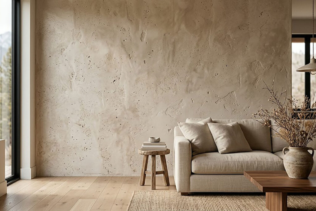
This is something we see regularly in wallcovering projects.
A dramatic wallpaper can rely heavily on pattern or color. A quiet white or off-white wallcovering has fewer visual distractions, so the eye begins to notice smaller details:
weave;
embossing;
fibers;
subtle tonal variation;
directional texture;
reflectivity;
matte versus satin surfaces;
natural irregularities;
seams;
and shadows created by the surface itself.
A pale linen wallcovering, for example, can create considerably more visual depth than a wall painted in a similar color.
Natural grasscloth can go even further. Its fibers, panel variation, and visible seams become intentional characteristics of the material rather than something hidden by color.
This is one reason we often tell clients that with sophisticated neutral interiors, the material may matter more than the exact shade name.
Wallpaper and paint can share a similar color but produce very different finished walls.
Paint creates color primarily through pigment, sheen, and the condition of the substrate.
Wallcovering can add another layer of visual information through construction.
Depending on the product, wallpaper may introduce:
woven texture;
printed depth;
raised embossing;
natural fibers;
subtle metallic detail;
textile construction;
directional movement;
or large-scale artwork.
This is particularly noticeable with whites, creams, and light neutrals.
A flat white painted wall can intentionally disappear into the architecture.
A white linen-look wallcovering may remain quiet while still giving the wall visible texture.
A natural fiber wallcovering can introduce substantial variation even if its overall palette remains very restrained.
A metallic white wallcovering may change significantly as daylight moves across the room.
None of these approaches is universally better. They simply create different surfaces.
For clients deciding between wallpaper and another type of wall treatment, we also work with decorative plaster finishes, including finishes where movement, texture, and hand application become part of the final appearance.
There is an important distinction when using Pantone trends in real interiors:
Cloud Dancer is a color reference. It is not a wallpaper specification.
A wallcovering manufacturer may produce a white, cream, ivory, linen, stone, or warm neutral that visually works beautifully with the Cloud Dancer concept without being an exact PANTONE 11-4201 match.
For residential interiors, that is often completely appropriate.
In practice, we look at the entire composition:
flooring;
cabinetry;
wood tone;
stone;
furniture;
window orientation;
artificial lighting;
trim color;
ceiling color;
adjacent rooms;
and the actual wallpaper sample.
The physical sample matters.
Screens are useful for narrowing choices, but color displayed on a phone or computer is not a reliable substitute for seeing an actual material in the room.
This is even more important with wallcoverings containing fibers, embossing, metallic elements, or directional textures because their appearance can change substantially depending on the angle of the light.
Natural wallcoverings are one of the strongest ways to make a quiet color palette feel intentional rather than empty.
Grasscloth, sisal, raffia, paper weave, and other natural fibers introduce texture and natural variation without requiring strong color or pattern.
They can work particularly well in:
bedrooms;
dining rooms;
home offices;
living rooms;
entry areas;
libraries;
and selected feature walls.
But natural materials need to be understood before they are ordered.
Visible seams, panel-to-panel variation, shading, and irregular fibers can be normal characteristics of genuine natural wallcovering.
They should not automatically be interpreted as installation defects.
This is why material selection and installation planning need to happen together.
Enjoy The Wall installs grasscloth and natural fiber wallcoverings and can help clients understand how a particular material is likely to look before installation begins.
For a minimalist Cloud Dancer-inspired interior, those natural variations can actually become one of the most beautiful parts of the finished wall.
For clients who want a controlled, consistent appearance, textured non-woven wallpaper can be another strong option.
Compared with natural grasscloth, many non-woven products offer:
more consistent coloring;
predictable pattern repeat;
lower panel-to-panel variation;
a broad range of printed and embossed textures;
and easier coordination across larger wall areas.
That can make them suitable for bedrooms, larger living spaces, home offices, hallways, and full-room installations where the goal is subtle texture rather than dramatic variation.
However, “light wallpaper” does not mean “easy wallpaper.”
Very pale materials can make some installation conditions more noticeable rather than less noticeable.
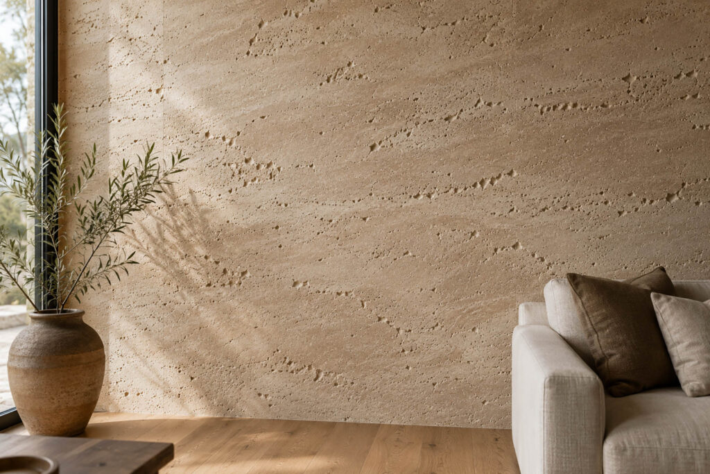
A quiet wallpaper does not necessarily hide an imperfect wall. In many cases, it reveals it.
This is one of the most important practical considerations in a Cloud Dancer-style interior.
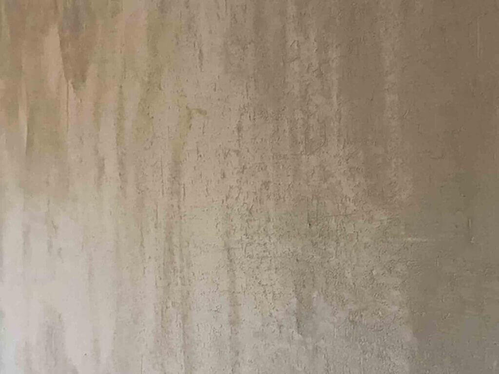
Depending on the wallcovering, insufficient preparation can allow the finished surface to reveal:
drywall repairs;
ridges;
heavy wall texture;
uneven sanding;
old adhesive;
paint defects;
surface contamination;
inconsistent wall color;
or other substrate irregularities.
Thin wallcoverings are particularly unforgiving.
Products with smooth surfaces or subtle sheen can also catch light across the wall and make imperfections easier to see.
The correct preparation depends on the specific wall and the specific wallcovering. We do not believe in prescribing the same preparation system for every project.
Instead, the wall needs to be evaluated together with the material and manufacturer requirements.
Our wallpaper removal and wall preparation work is therefore an important part of many installations, particularly when the new material has a pale, smooth, or highly refined finish.
They can, but seam visibility depends on many factors besides color.
Clients sometimes assume that white wallpaper automatically creates invisible seams. That is not necessarily true.
Seam appearance can be affected by:
wallpaper construction;
backing color;
printed surface;
material thickness;
wall color;
edge condition;
natural fibers;
lighting direction;
pattern;
installation method;
and the manufacturer’s intended seam appearance.
With some wallcoverings, properly installed seams can become extremely subtle.
With other products — especially natural grasscloth — seams are an inherent visual characteristic.
Lighting is also important. Strong light traveling parallel to a wall can reveal texture, surface variations, and seams more strongly than diffuse light.
We explain this in more detail in our guide to why wallpaper seams show.
Colorado gives us a useful real-world example of why material should be evaluated in the actual room.
Strong natural light can dramatically affect how a pale wallcovering is perceived.
A material that appears almost neutral under showroom lighting may look:
warmer;
cooler;
brighter;
flatter;
more textured;
or more reflective
once installed in a room with large windows.
Morning light and afternoon light can also produce noticeably different effects.
The same is true of artificial lighting. Warm and cool lamps can shift the perception of white and near-white materials.
For this reason, when a client is selecting a subtle wallcovering, we prefer looking at actual samples in relation to the room whenever possible rather than making the entire decision from a website image.
One of the more interesting options within quiet neutral interiors is a wallcovering that combines a light base with a restrained metallic element.
A small amount of metallic detail can react with daylight and artificial lighting without turning the room into a high-gloss space.
But these materials require careful selection.
Depending on the design and surface, metallic wallcoverings may emphasize:
directional lighting;
wall irregularities;
seams;
pattern alignment;
and changes in viewing angle.
This can produce a sophisticated result when planned correctly.
It can also produce an unexpected result when a material is selected only from a small online image.
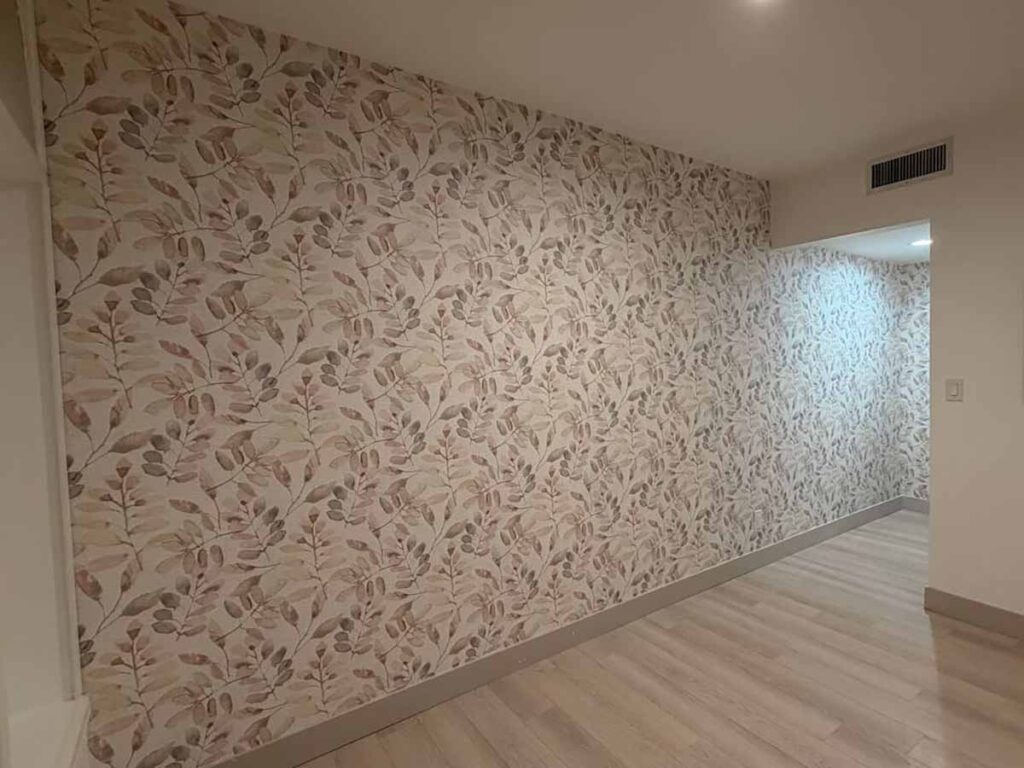
A restrained color palette does not require a plain wall.
Large-format murals can use whites, soft grays, warm neutrals, clouds, landscapes, botanical elements, abstract forms, or architectural drawings while keeping the room visually quiet.
The important difference is scale.
With murals, we are not only selecting color. We are also planning:
image placement;
crop;
focal point;
panel sequence;
ceiling and floor relationships;
doors and windows;
furniture placement;
and where important parts of the design will land on the wall.
This is why custom and large-format installations should be planned before material is cut.
Enjoy The Wall installs wall murals and custom prints for residential and commercial projects.
Cloud Dancer also translates well beyond wallpaper.
For clients who want a seamless surface, decorative plaster can create a light neutral wall with considerably more movement than conventional paint.
Depending on the selected finish and technique, this can include:
limewash;
Venetian-style plaster;
Marmorino;
concrete effects;
stone and travertine effects;
and other decorative finishes.
A major visual difference is that plaster creates texture through application rather than through a manufactured wallcovering.
At Enjoy The Wall, we work with both wallpaper and decorative finishes, so we do not need to automatically recommend one category for every room.
The better choice depends on the project.
Wallpaper may be preferable when the client wants pattern, textile character, natural fiber, a mural, or a very specific manufactured finish.
Decorative plaster may be preferable when the goal is a seamless hand-applied surface with movement and repairability.
A soft white palette can work throughout a home, but different rooms benefit from different materials.
Bedrooms are one of the strongest applications for soft neutral wallcoverings.
Linen, textile-inspired non-woven wallpaper, subtle natural fibers, and low-contrast patterns can add warmth without making the room visually busy.
For many bedroom projects, we prefer material texture over trying to create interest through high color contrast.
Home offices are another increasingly common location for refined wall treatments.
A subtle texture can create a finished background without competing with shelving, artwork, monitors, furniture, or video-call backgrounds.
Natural wallcoverings, sophisticated non-wovens, and selected decorative plaster finishes can all work well here.
In larger living spaces, a pale palette allows furniture, artwork, wood, stone, and architectural details to become stronger elements.
This is where texture becomes especially valuable because a large white wall can otherwise feel unfinished or visually flat.
Dining rooms can support more visible texture and, depending on the interior, natural grasscloth or understated metallic detail.
Lighting should always be considered because sconces, pendants, and chandeliers can dramatically emphasize wall texture.
A powder room is a small space where a restrained palette does not necessarily need to be conservative.
Texture, mural artwork, natural wallcovering, or metallic detail can create a highly designed room without relying on a strong color.
The material still needs to be appropriate for the room conditions and installed according to its specifications.
A soft light-colored wallcovering can also be used on ceilings.
Ceiling installation requires additional planning for layout, lighting fixtures, vents, seams, access, and installer control, but it can create a very distinctive result.
Because Cloud Dancer functions as a quiet neutral, it can support a broad range of combinations.
Pantone itself presents Cloud Dancer across multiple palettes rather than treating it as a color that must be paired with one specific family.
In interiors, we particularly like examining it alongside materials such as:
natural oak;
walnut;
warm stone;
travertine;
muted gray;
sand and taupe;
soft greens;
dusty blues;
charcoal;
black architectural accents;
natural linen;
aged brass;
and restrained bronze tones.
The correct combination depends on the undertones of the actual materials in the room.
This is another reason an exact online color recipe is less useful than examining real samples together.
One of the changes in how Enjoy The Wall now works with clients is that we are not limited to installation after somebody else has already selected and purchased the wallpaper.
We can help source the wallcovering, calculate the required quantity, review product specifications, and then install the material.
This creates a much better connection between design selection and field installation.
A wallpaper may look perfect aesthetically but still create practical questions involving:
roll dimensions;
pattern repeat;
panel format;
backing;
adhesive;
wall preparation;
minimum order quantities;
dye lots;
lead times;
or installation requirements.
Understanding those issues before ordering can prevent expensive problems later.
Enjoy The Wall works with a growing network of manufacturers and suppliers. Clients and design professionals can explore the wallpaper brands we source and install rather than limiting a project to one manufacturer.
We only want to sell materials we are comfortable standing behind as part of an installed project.
Wallpaper is unusual because the design decision and installation decision are closely connected.
A designer may select an extraordinary material, but the installer still needs to determine:
whether the substrate is ready;
how the pattern should be laid out;
where seams will fall;
how much material is required;
whether the walls are square;
whether corners affect the design;
where the pattern should start;
and what the manufacturer requires for preparation and adhesive.
For expensive wallcoverings, this coordination becomes even more important.
A quantity error can delay a project.
A new production lot may have a slightly different appearance.
An incorrect starting point can place the strongest part of a pattern in the wrong location.
And once material has been cut, some mistakes cannot simply be reversed.
This is why we encourage homeowners, designers, architects, builders, and general contractors to involve the installer early when possible.
For design professionals, our designer and trade support is built around that idea: select, source, plan, and install as one coordinated process.
Our recommendations are based on more than the sample book.
Before we recommend a material or installation approach, we may consider:
wall condition;
existing wall texture;
previous coatings;
room lighting;
window exposure;
material transparency;
backing;
pattern repeat;
seam expectations;
room use;
manufacturer instructions;
and the client’s expectations for the finished surface.
This matters particularly with expensive designer wallcoverings.
Our goal is not simply to install material onto a wall.
The goal is to understand how the wall + preparation + material + adhesive + layout + lighting + installation method will work together as a finished system.
Interior trends change. Installation fundamentals do not.
Enjoy The Wall’s recommendations come from years of professional work with walls, interiors, wallpaper, wallcoverings, decorative finishes, designers, builders, and homeowners.
Our team is led by Kris A., Co-Founder, Lead Installer & Design Consultant, whose professional background combines interior design knowledge with hands-on installation experience.
Kris A. is a member of both the Wallcovering Installers Association (WIA) and the Interior Design Society (IDS).
That combination matters because wallpaper should not be viewed only as a decorative product.
A successful project sits at the intersection of:
design;
material selection;
technical preparation;
installation;
and real construction conditions.
Our experience has also taught us not to make universal promises.
Different manufacturers specify different adhesives.
Different wallcoverings require different preparation.
Natural materials behave differently from vinyl.
A successful method with one product does not automatically become a recommendation for every product.
Manufacturer specifications remain the primary technical reference for a specific wallcovering.
Not necessarily. The Pantone designation is a trend event, but soft white interiors are much broader than a single year.
We would not recommend selecting a wallpaper solely because it carries a connection to the Color of the Year.
Instead, Cloud Dancer is useful as a way to discuss a broader design direction: quiet neutrals, texture, natural materials, restrained contrast, and surfaces that support the architecture rather than overpower it.
A well-selected natural grasscloth, linen wallcovering, subtle non-woven, mural, or decorative plaster should make sense because it works with the room — not because a trend report told the homeowner to use it.
That distinction is important for long-term interiors.
PANTONE 11-4201 Cloud Dancer is Pantone’s Color of the Year 2026, but on a real wall the material matters as much as the color.
Pale wallcoverings can emphasize texture, weave, sheen, seams, and substrate conditions.
Natural grasscloth provides character and variation; those variations are part of the material.
Non-woven wallpaper can provide a more controlled and consistent light-textured surface.
White wallpaper does not automatically hide seams or wall imperfections.
Strong natural and artificial lighting can significantly change the appearance of pale wallcoverings.
Wallpaper, paint, murals, and decorative plaster can create very different results even when they share a similar color palette.
Wall preparation should be determined by the actual substrate, wallcovering, and manufacturer requirements.
Selecting, sourcing, measuring, planning, and installing the wallcovering as one coordinated process can reduce costly mistakes.
Trends are useful for inspiration, but material quality, room conditions, and professional installation determine the finished result.
Cloud Dancer, PANTONE 11-4201, is Pantone’s Color of the Year 2026.
It is a soft white that Pantone presents as a versatile neutral capable of working alone or supporting other colors. In interiors, we see the concept as especially relevant to textured wallpaper, natural materials, quiet murals, and light decorative finishes.
It is best treated as a soft neutral white rather than relying on a simple warm-versus-cool label.
Its appearance can change beside flooring, cabinetry, stone, textiles, artificial lighting, and daylight. Always evaluate an actual material sample in the room rather than trying to choose a wallcovering from a screen.
Possibly, but an exact Pantone match is usually less important than finding the right wallcovering for the overall interior.
Wallpaper manufacturers work with their own colors, textures, printing systems, fibers, and finishes. A wallpaper can fit the Cloud Dancer design direction extremely well without being an exact PANTONE 11-4201 reproduction.
Neither is universally better; they create different types of surfaces.
Paint is excellent when the goal is a clean, simple architectural background. Wallpaper becomes particularly useful when the wall needs additional texture, pattern, fibers, embossing, artwork, or material character.
Usually not as much as people expect.
Some heavily textured products can visually disguise minor irregularities, but thin, smooth, light, or reflective wallcoverings can reveal substrate problems.
Proper wall preparation before wallpaper installation may therefore be especially important.
They can be. Seam visibility depends on the product, backing, edges, wall color, lighting, installation method, and the wallcovering construction.
Natural grasscloth is a good example of a material where visible seams and panel variation may be normal rather than defects.
Yes, when the client wants natural texture and accepts the characteristics of genuine natural wallcovering.
Grasscloth can bring depth to a nearly monochromatic room without requiring a strong pattern. However, color variation, fibers, shading, and visible seams should be expected with many natural materials.
Yes. A light wallcovering can work very well in small spaces, but the result depends on more than color.
Pattern scale, texture, lighting, furniture, ceiling height, and contrast with adjacent surfaces all influence how large or small a room feels.
Yes, provided the specific wallcovering is appropriate for the conditions and installed according to manufacturer requirements.
Bathrooms vary significantly in ventilation, moisture exposure, wall construction, and direct water contact, so product selection needs to be made for the actual room rather than simply by color.
Yes. Enjoy The Wall can help with sourcing, quantity planning, material review, and installation.
We work with homeowners as well as interior designers, architects, builders, and general contractors. Our goal is to connect material selection with the technical realities of the installation rather than treating those as unrelated stages.
Yes.
Clients can come to us with wallpaper they have already purchased. We can evaluate the material and project conditions and determine the appropriate installation approach based on the product specifications and wall conditions.
For simple projects it may work, but for expensive, custom, natural, or large-pattern wallcoverings, involving the installer before ordering is often the safer approach.
Pattern repeat, wall dimensions, roll format, waste, placement, dye lots, and special installation requirements can all affect the quantity required.
Planning a wallpaper project in the Denver metro area or elsewhere in Colorado?
Enjoy The Wall works with homeowners, interior designers, architects, builders, general contractors, and commercial clients on projects ranging from individual feature walls to specialty wallcoverings and multi-room installations.
Our team can help evaluate the selected material, wall condition, layout, preparation requirements, and installation approach before work begins.
+1 (720) 825-7157
Proudly working with clients statewide.
Cloud Dancer is a useful design reference, but a successful wall is ultimately created by the right combination of material, surface preparation, lighting, layout, and installation.
Enjoy The Wall helps homeowners, interior designers, architects, builders, and general contractors select, source, plan, and install wallpaper and decorative wall finishes throughout the Denver metro area and across Colorado.
Whether you already have a wallcovering selected or are still comparing materials, we can help evaluate the project before installation begins.
Explore Wallpaper & Wallcovering Services · All Services
For Interior Designers, Architects & Builders · View Recent Projects

Find wallpaper, decorative plaster, brands, guides, FAQs and blog articles.